Evolve Branding
Evolve Physical Therapy is relatively new clinic that opened its doors in response to an increasing need for personal and high quality health care. With years of combined experience to draw from, they forged a new practice built on the strength of professional wisdom and a keen awareness of industry trends and technology. They want to not only treat their client’s short-term injuries, but offer a comprehensive approach that focuses on improving the lives of their patients.
From the very beginning, Evolve recognized the importance of brand identity and had a clear vision of what that should look like. They took the time to contemplate this and provided insightful information about who they were and what they wanted to do as a clinic. In addition, mock-ups of ideas were provided and they had a color scheme established. Ganyoon Graphics was brought in to better define and refine those ideas into a final, professional form.
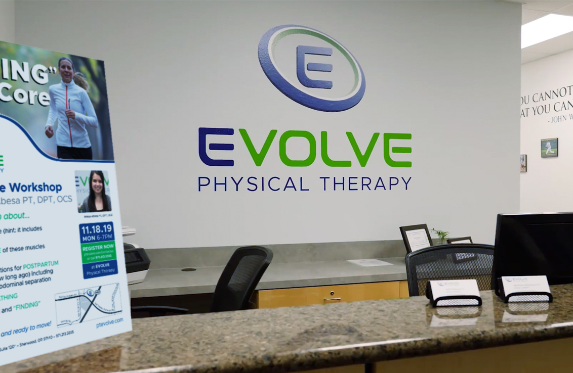
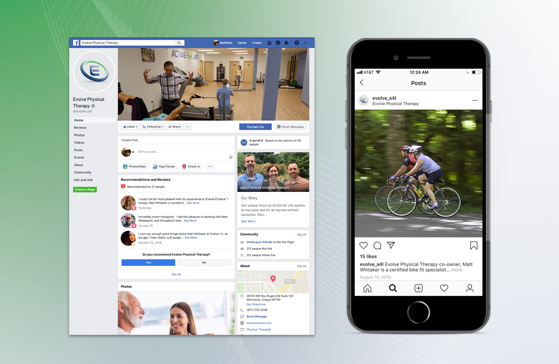
We wanted to be sure that the logo and type could be seen at distances both near and far. It needed to look good on an outdoor sign as well as on a small social-media thumbnail. Bold type was chosen for this reason. It conveys strength and confidence. At the same time, the branding needed to be warm and inviting. Rounded corners were introduced along with gentle gradients and subtle shadowing to bring a 3-dimensionality to the table. By giving the logo a more real-world appearance, this helped to further identify Evolve as a physical therapy clinic.
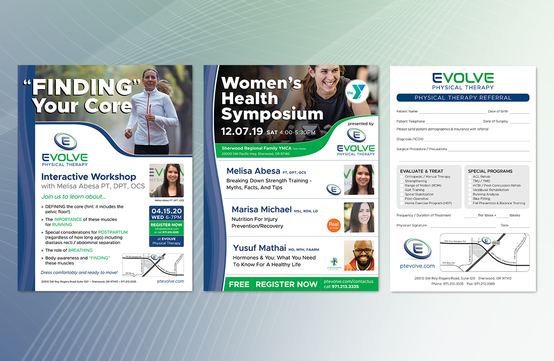
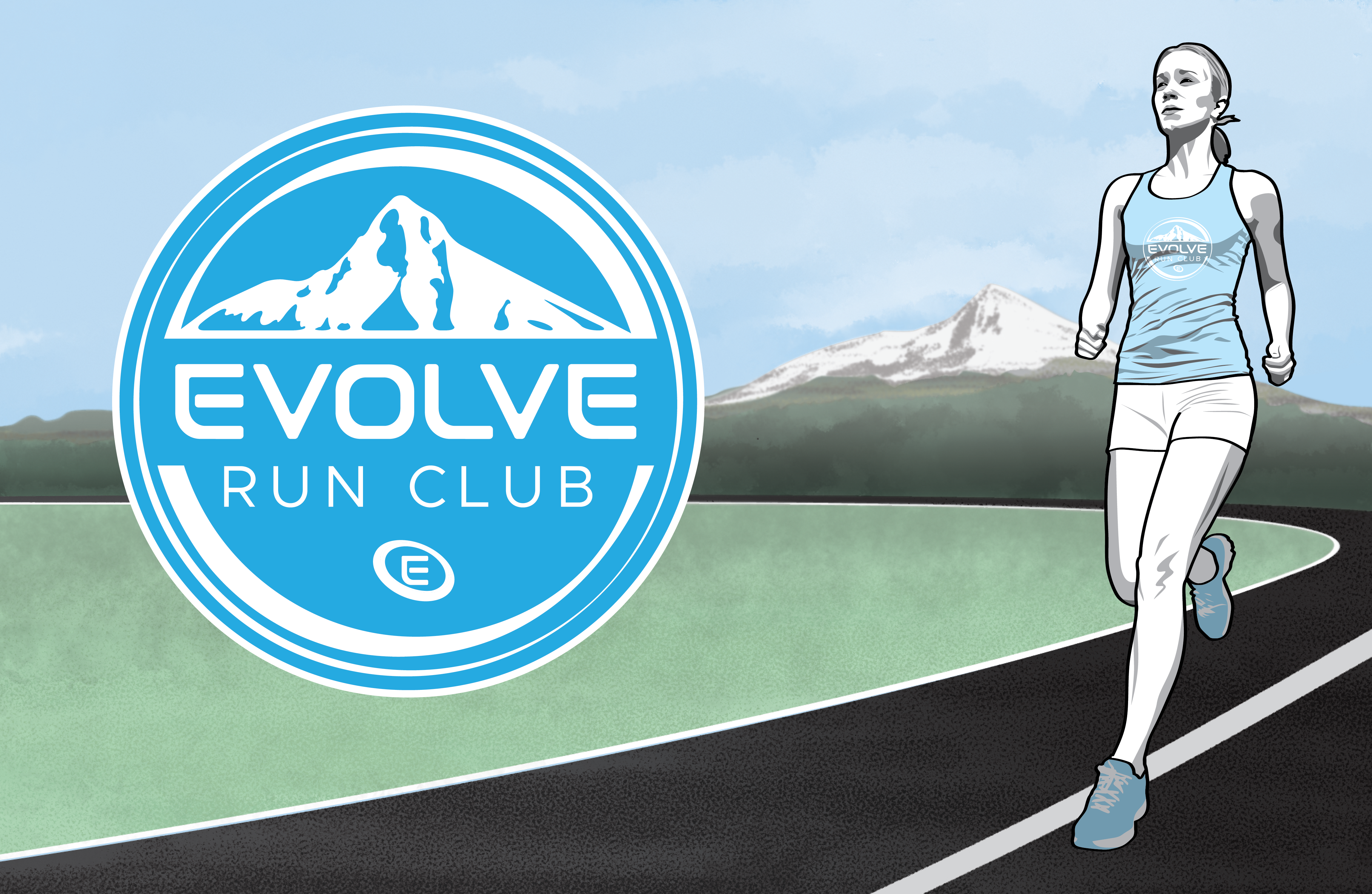
Evolve Physical Therapy has gone on to become one of the top-rated clinics in Sherwood, OR. They even won the Rookie of the Year award from the Chamber of Commerce in 2018. Their commitment to delivering quality care has garnered glowing reviews and referrals. The branding has been used on water bottles, t-shirts, banners, and wall signs. It has also been adapted for their run club which promotes a healthy lifestyle for their community members.

