Nasalrod
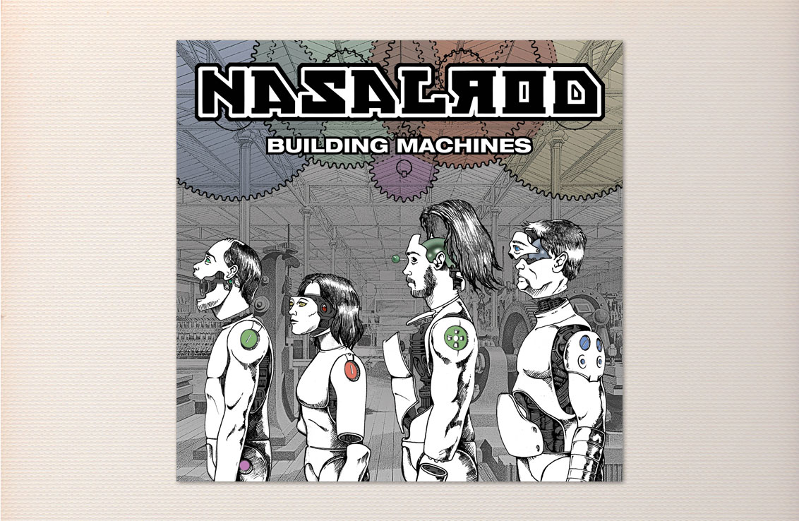
Nasalrod’s second release, Building Machines, is a refined collection of highly energized, and very-well-executed rock songs. The lyrics of the title track deal with the stresses of the daily grind and feeling like cogs in the wheels of industry. Hence, the depiction of the band as machines in a factory.
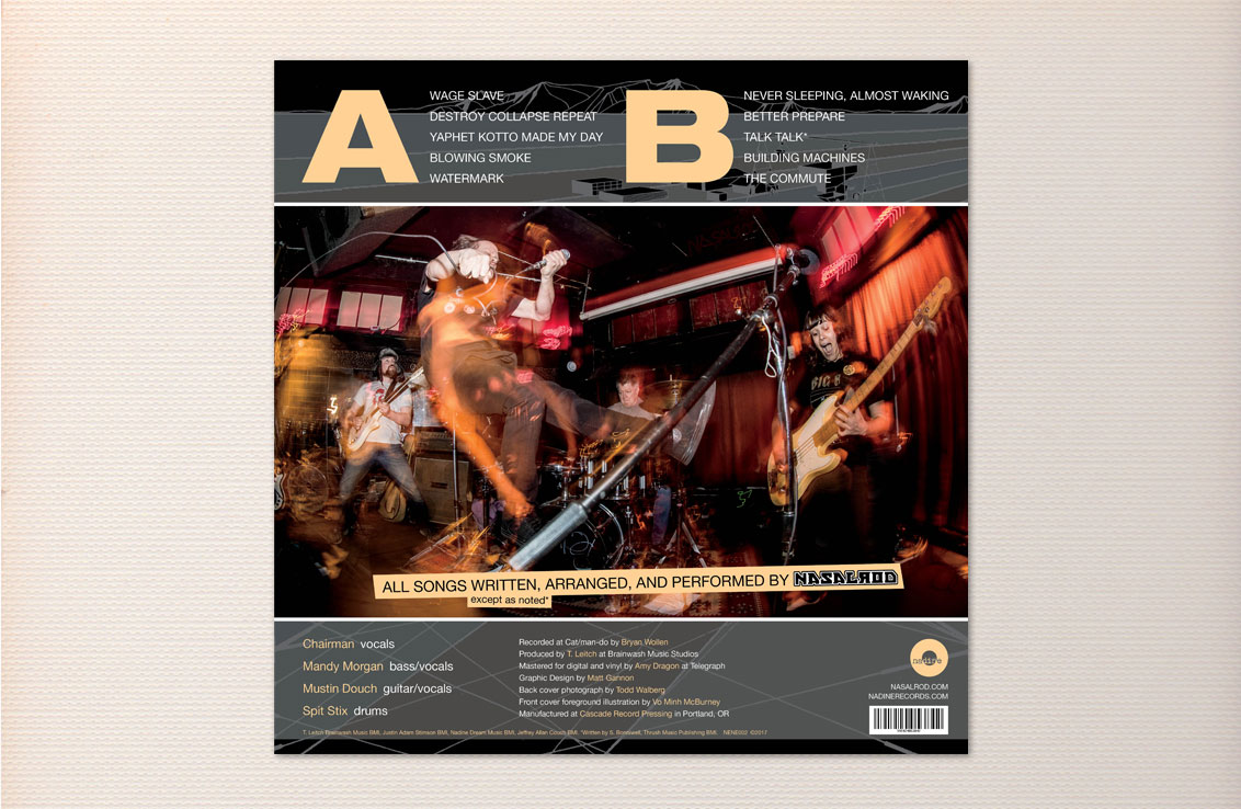
Initially, I was brought in to do the layout for this project. I was given text, one photo, and the line-art illustration of the four band members to be used on the cover. Illustrator, Vo Minh McBurney, supplied us with a remarkable line drawing of the four band members as partially disassembled (or nearly assembled) robots. That in itself was amazing, but we needed to give these characters a proper setting. The band wanted a factory background that gave the cover a sense of depth. This is where my image compositing skills were used to set the stage. After a good deal of searching, a public domain 1-point perspective drawing of a late 19th century factory floor was found to be an ideal backdrop. Technical schematic drawings were added along with some color to bring it all together.
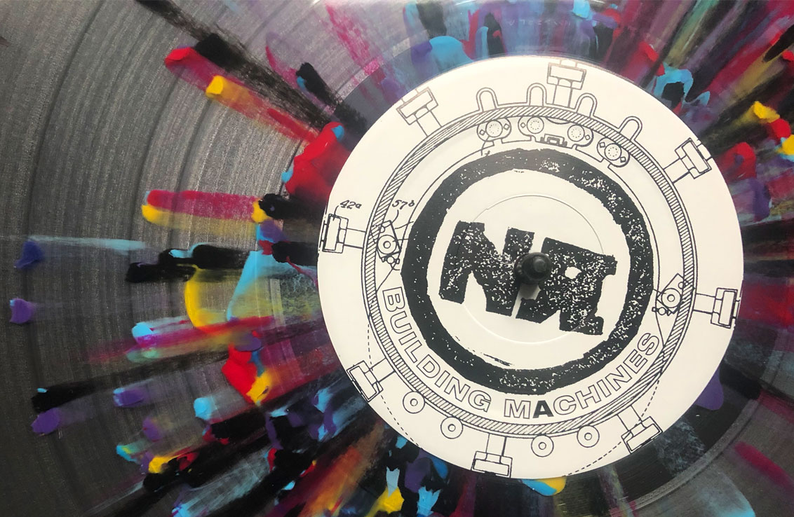
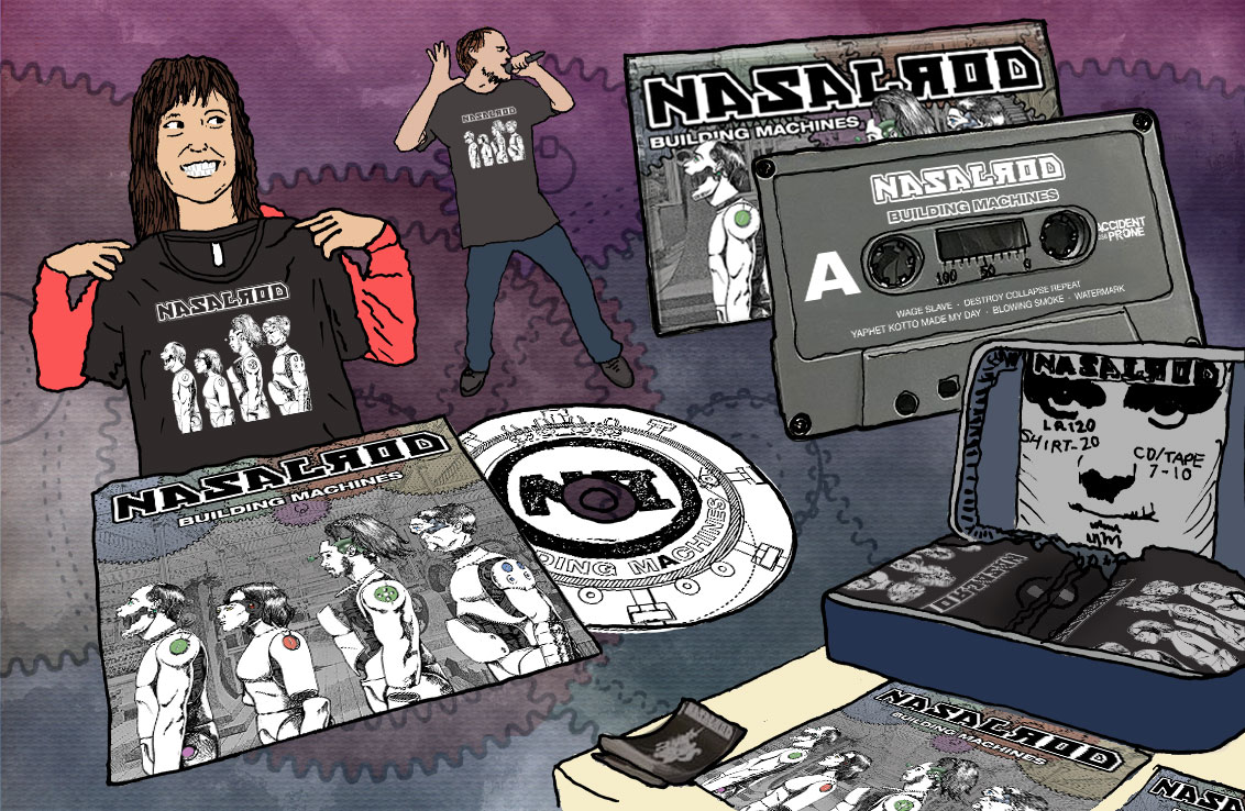
Building Machines has gone on to be the band’s most successful release yet. It has garnered positive reviews and buoyed their tours with numerous direct sales. Beyond vinyl, the art has been resized for compact discs, cassettes, posters, and digital media assets. It has also been distilled as 1-color line art to appear on t-shirts.
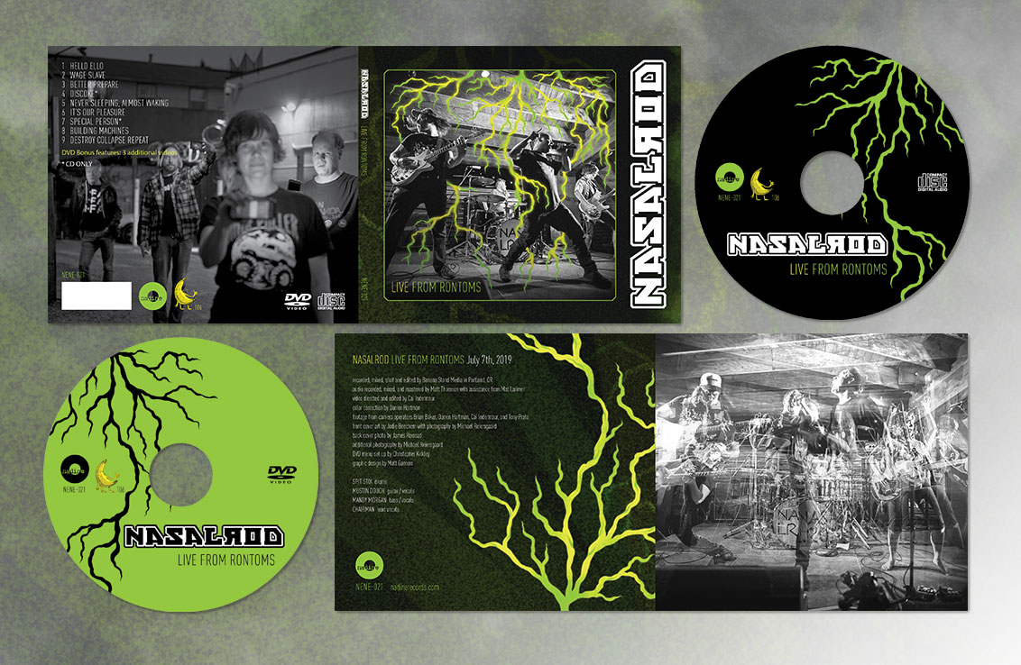
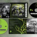
Hot off the heals of Building Machines, Nasalrod next released Live From Rontoms a few years later. They contacted me to help put the packaging together for this CD/DVD release. Similar to their previous release, this was a collaboration. The lightning was illustrated by Jodie Beechem and photos were taken by Michael Reiersgaard and James Rexroad. Ganyoon Graphics was responsible for combining it all into a cohesive package. When the band couldn’t decide on which photo to use for the interior right panel, I suggested we use them all! Since many of these shots were taken in succession from the same vantage point, I realized that it would work like a stroboscopic exposure. This gave the image a sense of explosive motion that defines Nasalrod’s stage presence.

