The Old Church
The Old Church (TOC) is a nonprofit, all-ages venue and historic landmark in Portland, Oregon. Built in 1882, it is on the National Register of Historic Places. Its dual mission is to produce and promote music and arts programs that reflect and enhance the cultural life of the community and to preserve and celebrate the building’s historic architecture. Hosting over 700 events a year, this 300-seat venue offers great ambience and pristine acoustics.
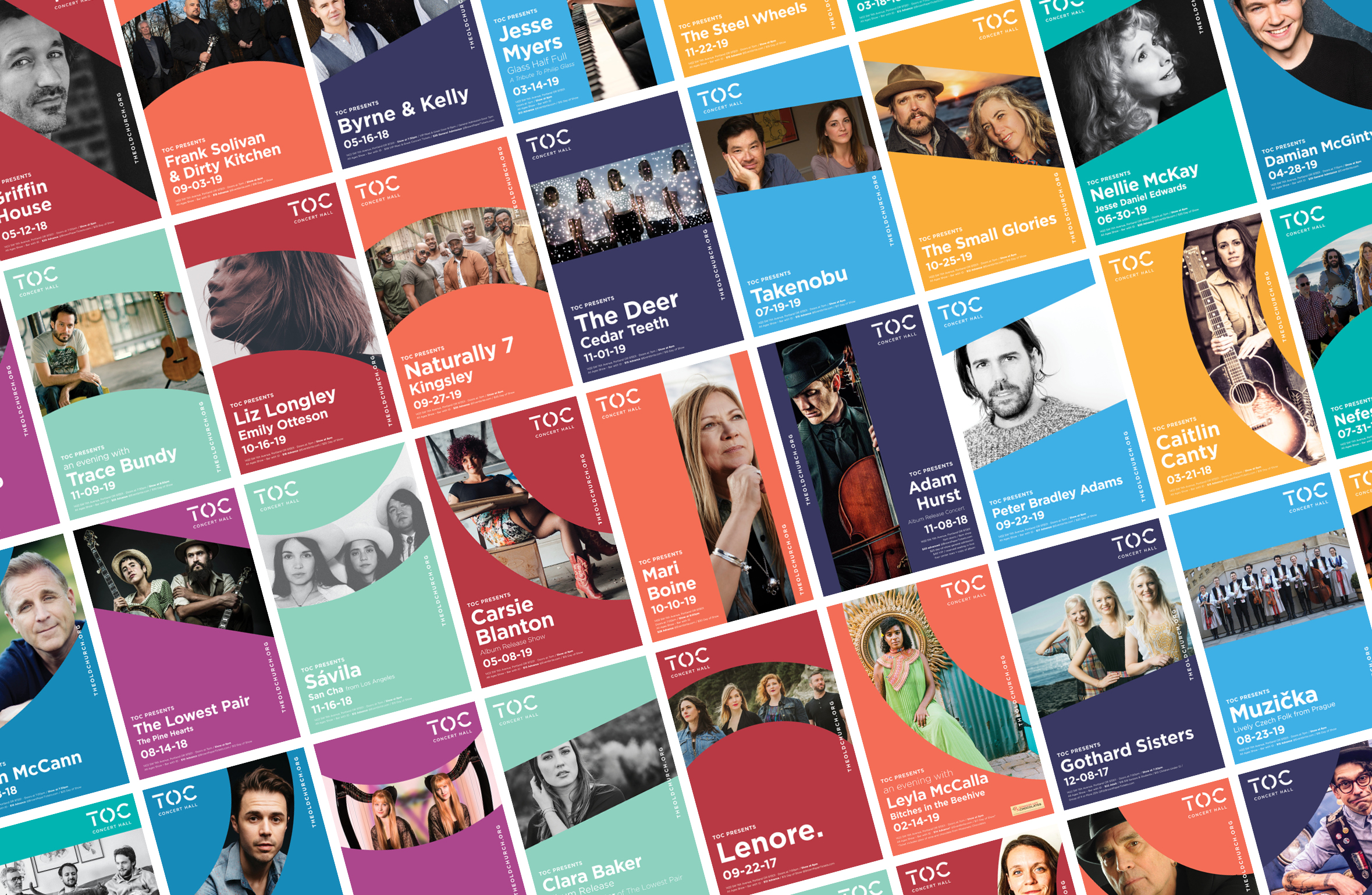
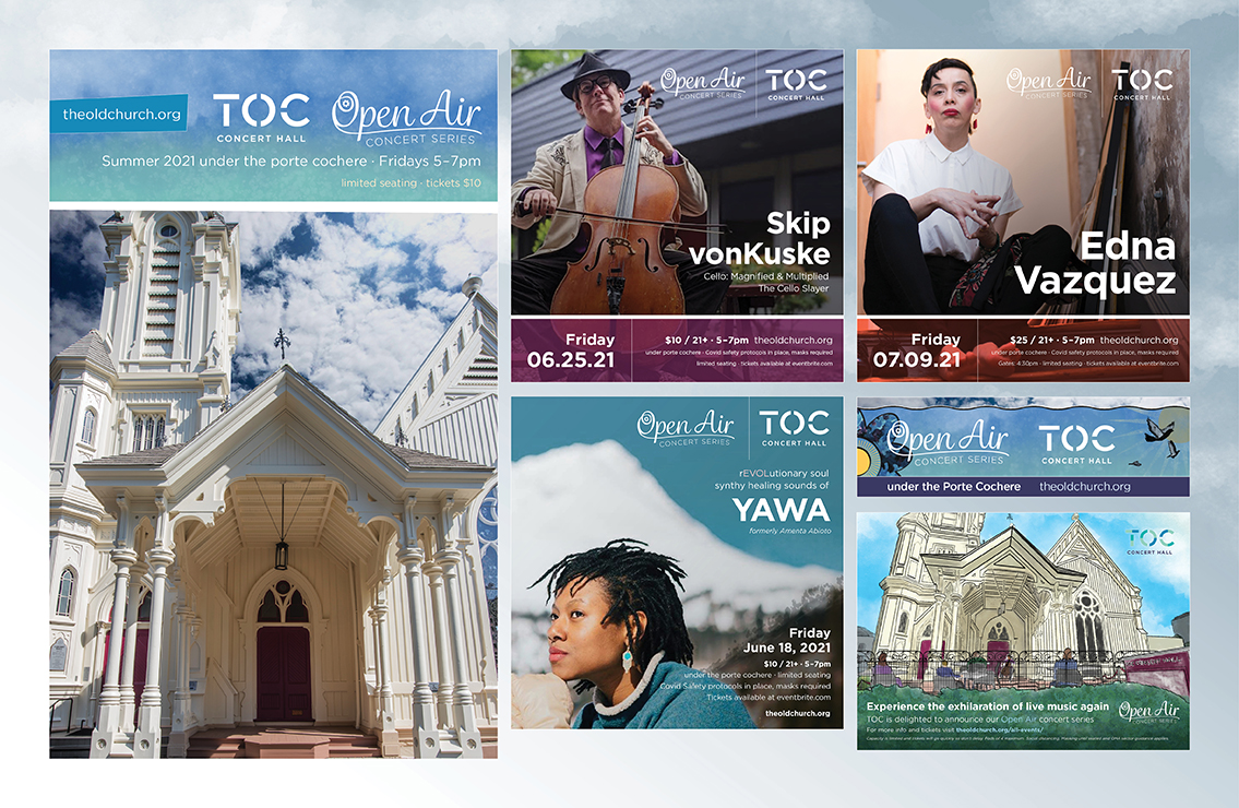
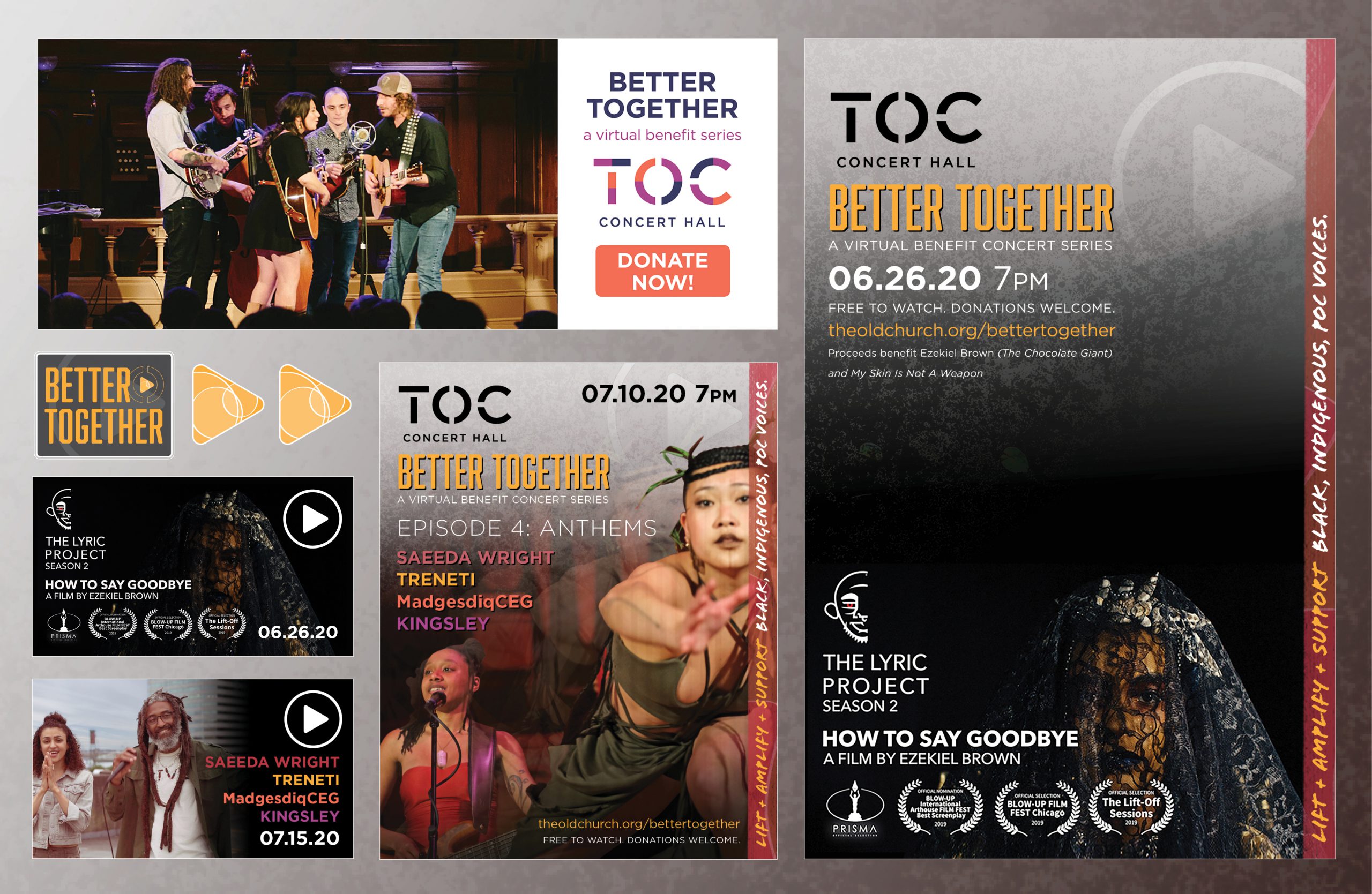
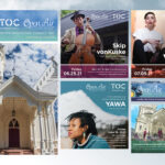
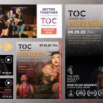
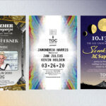
Having ongoing events requires constant promotion. For many of the shows that The Old Church would present, I created a unique poster. Graphics from these were both printed and used online for social media. The branding and concept for the general flyers was initially developed by Studio DAD. As the production designer for TOC, I carefully implemented DAD’s recommendations detailed in the branding guide.
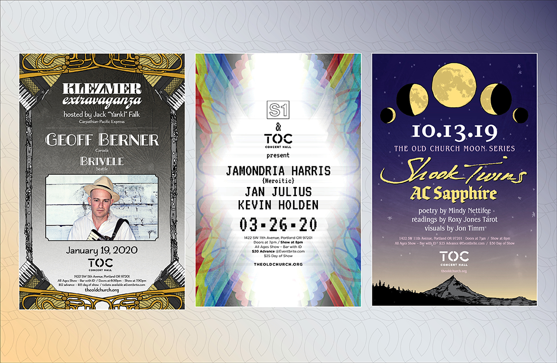
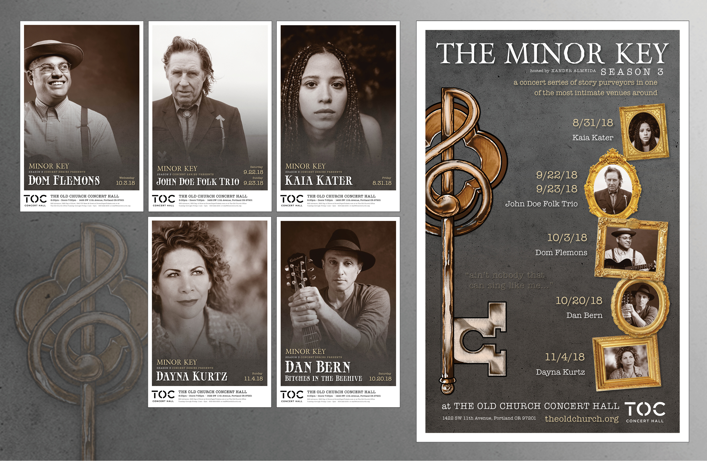
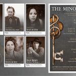
For the concert series that required their own separate identities, Ganyoon Graphics would establish the look. Typefaces, color palettes, and illustration would be introduced to work in conjunction with the main branding. For the Americana series The Minor Key, muted colors, sepia imaging, along with an overall gritty appearance distinguished these shows from the typical vibrant colors of the regular posters. Illustrations of instruments used in Klezmer music were dual-purposed as both a framing element and to inform the viewer of the sounds involved in the Klezmer Extravaganza shows. For the S1 experimental electronic poster, multi-colored lines were rendered in marker and then mirrored in Photoshop to represent patch cables used in analog synthesis. The Moon Series involves multimedia events with artists of varying disciplines from both the sonic and visual realms. Bold celestial images of the moon were placed above a mountain terrain to emphasize the cosmic theme as well as establish the venue’s Cascadian setting.
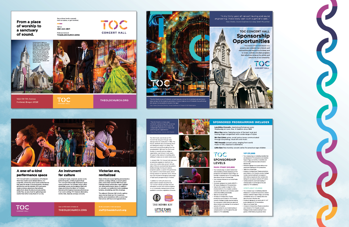
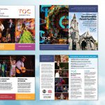
In addition to promoting events, Ganyoon also assisted in the non-profit’s fundraising efforts. In addition to ticket sales, donors are key players to the TOC’s success. To raise money for upgrades and building maintenance, sponsorship brochures were designed to neatly display all the ways to contribute along with incentives to reward generosity. Colorful, inspiring photos along with easy-to-read tiers of sponsorship levels were listed along uplifting text informing readers how their donations support the venue. These contributions have been instrumental. Not only do they sustain the non-profit organization and maintain the building itself, they also helped to turn this space into one of the best rooms in town.

